There has been much discussion surrounding the cover of the new David Bowie albumThe Next Dayso thought I would answer a few questions that people have asked about it.
– Why not a new image for the cover?
We wanted to do something different with it – very difficult in an area where everything has been done before – but we dare to think this is something new. Normally using an image from the past means, ‘recycle’ or ‘greatest hits’ but here we are referring to the titleThe Next Day. The“Heroes”cover obscured by the white square is about the spirit of great pop or rock music which is ‘of the moment’, forgetting or obliterating the past.However, we all know that this is never quite the case, no matter how much we try, we cannot break free from the past. When you are creative, it manifests itself in every way – it seeps out in every new mark you make (particularly in the case of an artist like Bowie). It always looms large and people will judge you always in relation to your history, no matter how much you try to escape it. The obscuring of an image from the past is also about the wider human condition; we move on relentlessly in our lives to the next day, leaving the past because we have no choice but to.
– Why “Heroes”?
If you are going to subvert an album by David Bowie there are many to choose from but this is one of his most revered, it had to be an image that would really jar if it were subverted in some way and we thought“Heroes”worked best on all counts. Also the new album is very contemplative and the“Heroes”cover matched this mood. The songWhere are we now?is a comparison between Berlin when the wall fell and Berlin today. Most people know of Bowie’s heritage in Berlin and we want people to think about the time when the original album was produced and now.– Why the white square obscuring the image?
We worked on hundreds of designs using the concept of obscuring this cover but the strongest ones were the simplest – it had to be something that was in direct contrast to the image underneath but that wasn’t too contrived (we know all design is contrived, that is the essence of the word ‘design’). It would have been clearer to many people if we had scribbled all over the cover but that didn’t have the detachment of intent necessary to express the melancholy of the songs on the album. Obscuring Bowie’s image is also reference to his identity, not only in the past when he changed endlessly but that he has been absent from the music scene for the past ten years. Was this an act to hide his identity or that he has simply become more comfortable with it?– Why is there no colour?
The title of the albumThe Next Dayevokes numerous reference points, notably Macbeth’s speech ‘Tomorrow, and tomorrow and tomorrow ’ which deals with the relentless onward push that any unnatural position of power requires. It also has the existential element ofWaiting for Godotwith waiting forThe Next Day– these all seem to question the nature of existence so a monochrome palette seemed most appropriate to this feeling.– Why didn’t you do a logo, or new design of his name on the cover?
We wanted the cover to be as minimal and undesigned as possible, we felt the most elegant solution was to use the original one from“Heroes”and simply cross out the title of the old album. It has the detachment appropriate for the atmosphere of the new album.– What is the font you used for the main title?
It is a new font that we are working on called Doctrine – this is the first major use of it. Doctrine will be released in the coming weeks atVirusFonts.– What is Bowie like to work with?
He is quite a private person, so no need to say too much about him other than that he is a pleasure to work with. Very intelligent, funny, serious when he needs to be and generous in his thoughts and actions.– Is there anything else you can add?
Yes, having said all this, we know it is only an album cover with a white square on it but often in design it can be a long journey to get at something quite simple which works and that simplicity can work on many levels – often the most simple ideas can be the most radical. We understand that many would have preferred a nice new picture of Bowie but we believed that would be far less interesting and not acknowledge many of the things we have tried to discuss by doing this design. Finally we would like to give David Bowie great credit, he simply did what he always does which is to go with a radical idea and that takes courage and intelligence. That is why we love his music and love working for him.
The Beef.
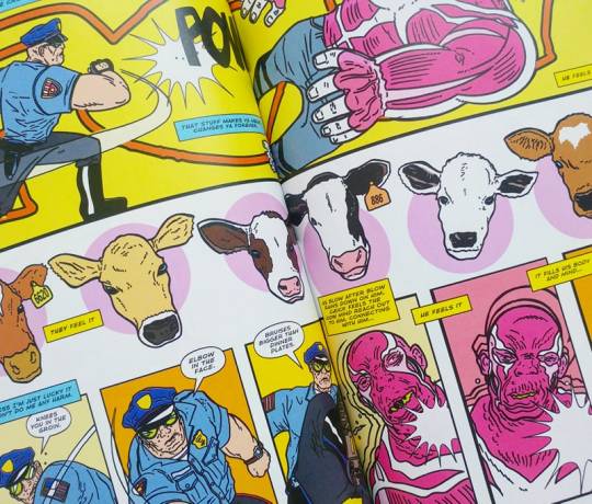
A Frankensteinian superhero for the fast food era where no radioactive spiders or chemical plant explosions are required – just a steady, tasty diet of.. the beef.
“Chuck Carter is a good man. Chuck has shot penetrating bolts into the skulls of approximately 23,000 cows in his lifetime. This hasn’t affected him at all.”
The combination of Richard Starkings & Tyler Shainline’s bleakley satirical writing with Shaky Kane’s gloriously garish artwork creates the perfect marriage of love/hate Americanna – both indulging in and vilifying it’s reference points. It’s hard not to love the nostalgic crassness of the signposts of American culture and this story allows the reader to revel in it’s plasticy glory whilst also, not so much peaking below the surface as ripping the skin off and making you stare at the pulsing viscera underneath.
As fun and entertaining as it is horrifying and grim, it’s a rare (pun intended) comic book than can successfully take down consumption culture in all its forms (food, labour, sex) and include a two-page spread on the ugliness of the dairy industry with an unflinching focus on the most grooey home truths without veering into over-worthy browbeating. You’ll finish The Beef with a gnawing feeling in your stomach – it’s probably guilt, but it might be hunger.
AUTHOR: Richard Starkings / Tyler Shainline / Shaky Kane
TITLE: The Beef
David Bowie: The Next Day. That album cover design by Barnbrook Design

Creative Review – UK Music Video Awards 2011 Winners
Creative Review – UK Music Video Awards 2011 Winners
The UK Music Video Awards are voted for by people working in and around the promos industry, so are viewed as an insider’s take on the best music video work of the year. This year saw a widening of the awards to include international winners in every category, alongside a favourite UK winner. Canada, who were profiled in the October issue of CR (read the article here), also picked up the Best Pop Video – International award for Oh Land by White Nights and the Best Art Direction and Design gong for Invisible Light by Scissor Sisters (both shown below).
Great to see Invisible Light getting some love 😀
Alex Steinweiss, Originator of Artistic Album Covers, Dies at 94

The record cover was a blank slate in 1939, when Mr. Steinweiss was hired to design advertisements for Columbia Records. Most albums were unadorned, and on those occasions when art was used, it was not original. (Albums then were booklike packages containing multiple 78 r.p.m. discs.)
“The way records were sold was ridiculous,” Mr. Steinweiss said in a 1990 interview. “The covers were brown, tan or green paper. They were not attractive, and lacked sales appeal.” Despite concern about the added costs, he was given the approval to come up with original cover designs.
His first cover, for a collection of Rodgers and Hart songs performed by an orchestra, showed a high-contrast photo of a theater marquee with the title in lights. The new packaging concept was a success: Newsweek reported that sales of Bruno Walter’s recording of Beethoven’s “Eroica” symphony increased ninefold when the album cover was illustrated.
“It was such a simple idea, really, that an image would become attached to a piece of music,” said Paula Scher, who designed record covers for Columbia in the 1970s and is now a partner in the design company Pentagram. “When you look at your music collection today on your iPod, you are looking at Alex Steinweiss’s big idea.”
Mr. Steinweiss preferred metaphor to literalism, and his covers often used collages of musical and cultural symbols. For a Bartok piano concerto, he rejected a portrait of Bartok, using instead the hammers, keys and strings of a piano placed against a stylized backdrop. For a recording of Gershwin’s “Rhapsody in Blue,” he used an illustration of a piano on a dark blue field illuminated only by an abstract street lamp, with a stylized silhouetted skyline in the background.


Mr. Steinweiss left the music business at 55, when he realized his design ideas were out of step with the rock era. He turned to his own art, making ceramic bowls and pots and later paintings, often with a musical theme. In 1974 he and his wife moved to Sarasota.
Mr. Steinweiss said he was destined to be a commercial artist. In high school he marveled at his classmates who “could take a brush, dip it in some paint and make letters,” he recalled. “So I said to myself, if some day I could become a good sign painter, that would be terrific!”
Via: NY Times
Cindy Sherman for MAC

Cindy Sherman for M·A·C Via Baroque Boudour
M·A·C is forever asking “Why not?” when it comes to the miracles of makeup – our medium for transformation – always exploring new ideas about the many ways we long to look and feel different for a day, a night, a lifetime. With the help of props, makeup, prosthetics, wigs and sets, artist Cindy Sherman embodies this Power of Transformation – from off-kilter Hitchcock heroine to fresh corpse, Caravaggio Portrait to Park Avenue Plastic Surgery Maven – all elaborate exercises in trying on different personas. In the campaign we’ve longed forever to conceive, Cindy Sherman for M·A·C created three characters using three different colour stories. We’re living in a time when people of all persuasions have become bolder than ever about the ways they choose to express themselves: with a colourful palette of possibilities, You are the Artist, You are your own Subject, and no matter how fearfully you begin, you become fearless in the process. We can’t wait to see what you (and the genius that is Cindy Sherman) do next!
– M·A·C
Marilyn on ‘Four Rooms’
MM collector Gene London (also a former children’s TV host and fashion designer) brought one of his most prized possessions – a sketch by Marilyn, Myself Exercising – to the UK recently for an appearance on Channel 4′s antiques show, Four Rooms.
London was offered £150,000 by dealer Jeff Salmon but, incredibly, turned it down. I can understand why – not from a financial point of view – but to me, that sketch is one of the loveliest things Marilyn left behind. It should either go to someone who truly adores it, or preferably, be donated to a museum.
UK readers can watch the show here (the sketch is the final item, saving the best for last.)

(via Marilyn on ‘Four Rooms’ | ES Updates)
I just watched this tonight – it’s only the second episode I’ve seen of the program and I quite like it – but I agree, I wouldn’t have sold it to them either. The poor man clearly loved it the way it should be loved and I’m not convinced he really wanted to sell it at all.
He said he wanted to sell it to buy costumes at a forthcoming auction, but personally I would far rather own this than a dress – even ‘the’ dress.
We don’t talk about love. We only want to get drunk.


I can’t decide if this is quite funny or extremely annoying. I’m guessing the artist is popular at parties either way..
(via Best Modern Artist Ever Presents Drinking Art – Geekologie)
Book Review: Killer Photos with Your iPhone by Matthew Bamberg, Kris Krug and Greg Ketchum
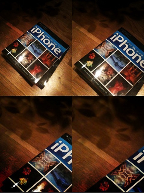
Since getting my first iPhone I find I am using it to take almost all my photographs (bar those that require particularly high-res or studio quality) partly because of convenience but largely because of the amazing options for in-phone photo editing and sharing. So it was with great excitement that I received my copy of of ‘Killer Photos with Your iPhone’ through the post..
“Killer Photos with Your iPhone shows students how to take fantastic pictures using the camera built right into their iPhone. Because of its portability and unique capabilities, the iPhone camera is now one of the most popular digital cameras on the market, and this book shows you how to do everything from taking simple pictures to using apps to snap and create innovative images. You’ll find information on the basics of shooting with an iPhone, including how to aim, compose, and focus your shots, as well as shooting within an app platform, and even post-processing. Many of the most popular photography apps are covered, and explained option-by-option with full-color images that allow students to see the progression of the app all at once instead of step-by-step. Covering both the 3G and 3GS iPhone models, this book will have students shooting, editing, and sharing killer photos in no time!”
The first section of the book is aimed at beginners learning the basics (both of the iPhone specifically and photography in general) however there are lots of handy tips and hints that seasoned users may find useful too.
However it’s the second half of the book that I personally got the most out of. It covers more detailed issues such as dealing with various kinds of lighting (often one of the few real problem areas of the iPhone camera) and, most interestingly for me, guides to post-processing apps such as Photoshop.com, CameraBag, PhotoForge, FX Photo Studio and Tiffen Photo. The book goes into each featured app in great detail and as well as discovering a few apps I hadn’t heard of I also learned quite a few new things about ones I already used.
I really enjoyed this book – I found it very easy to read and useful. The language is engaging and informal throughout (not too geeky for the casual gadget owner) but at the same time not as forcedly ‘humorous’ as the Dummies guides. I would definitely recommend it to anyone with an iPhone regardless of knowledge base.That said, I would particularly recommend it to any iPhone users who are new to photography as well as it really frames iPhone photography within improving your photography skills in general.
Follow the authors on Twitter >>
As a side note you can see some of my own iPhone photography and art here and a ‘phone art’ event that I helped organise here.